Color of the Year, 2021 Inspiration
Denise Jadd
Color of the Year 2021
If you’re a big lover of all things design, like me, and follow all the trends of what’s happening in our design industry, you’ll be excited to hear the latest news! Today, one of the big trade announcements in color, Color Of The Year, was revealed. The hype that surrounds this for trade professionals can be compared to waiting for Black Friday for holiday shoppers. We can’t wait for the surprise in store!
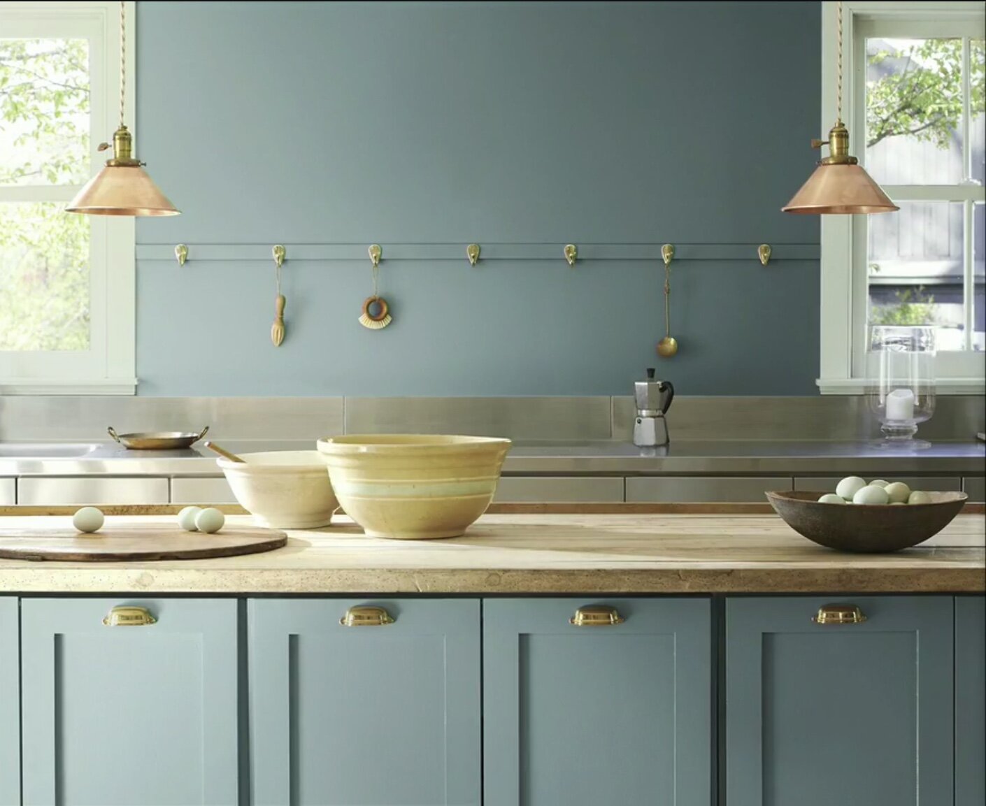
Benjamin Moore declares Aegean Teal as it’s Color of the Year for 2021.
This tertiary color is a mix of a primary (blue) and secondary color (green). The saturation is midway, and rather rich.
The Meaning of Green
Greens are restorative. They can be calm or full of energy, but usually it reflects nature, and if you’ve been reading our blog, you know we are fanatical about bringing nature in with biophilic design! This blued green is grayed down, yet saturated and instills a gentle nature. We see this shade in Spring as it can be a symbol of growth and possibilities, and thus optimism. It is stabilizing, and it can be purposeful: it balances the head with the heart, as we feel the emotional harmony with this color in different color palettes. It’s earthy but it restores. It feels solid, yet it yields. You can count on this one being a steadfast classic. Being a combination of blue and yellow, greens can bring mental clarity, wellness and optimism. Who doesn’t need more straight thought and a sunny outlook, especially now? Raise your hand! 🙋🏼♀️
Color can be so dynamic!
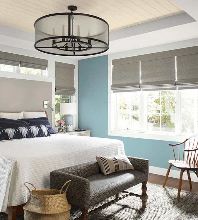
Depth, dimension, nuances, reflectivity. Getting color right in a bedroom is a top priority for our clients well being, as we wake and fall asleep to the color on the walls in this important sanctuary space. Color affects our mood. This cool and calm coastal COTY enlivens this room, and yet it is serene and soothing. If you need a good wink, you may rethink your bedroom hue.
Like the mix of this classic kitchen table, rounded by modern Bertoia chairs, with a cozy black and white pillow plumped settee, the right pieces mingle effortlessly, with an unbuttoned elegance, and a joyful appearance. The COTY Aegean Teal, grounds this eat in breakfast space, and the yellow vase of yellow sunflowers welcome us to join around the table. Wellness at home is served.
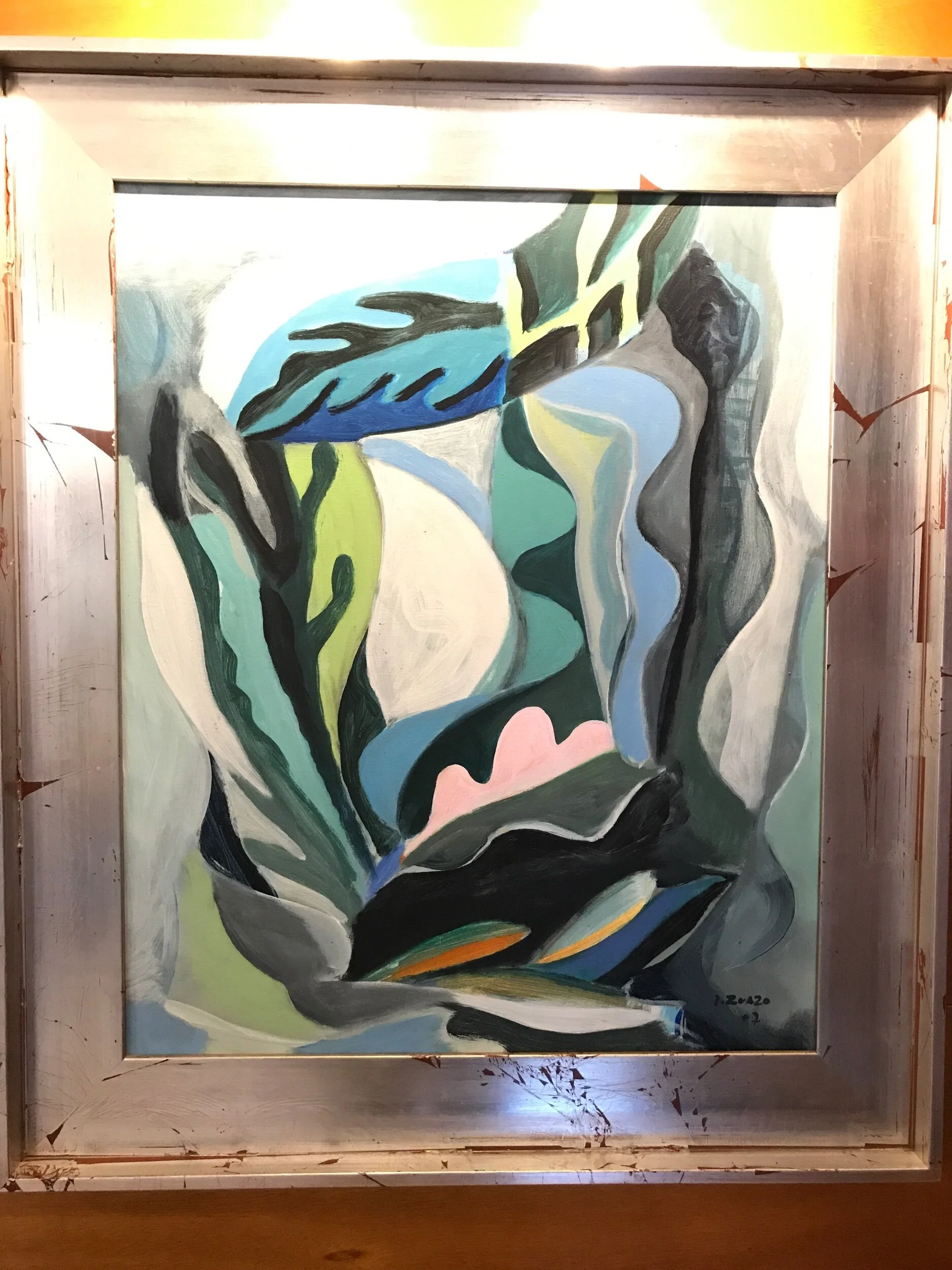
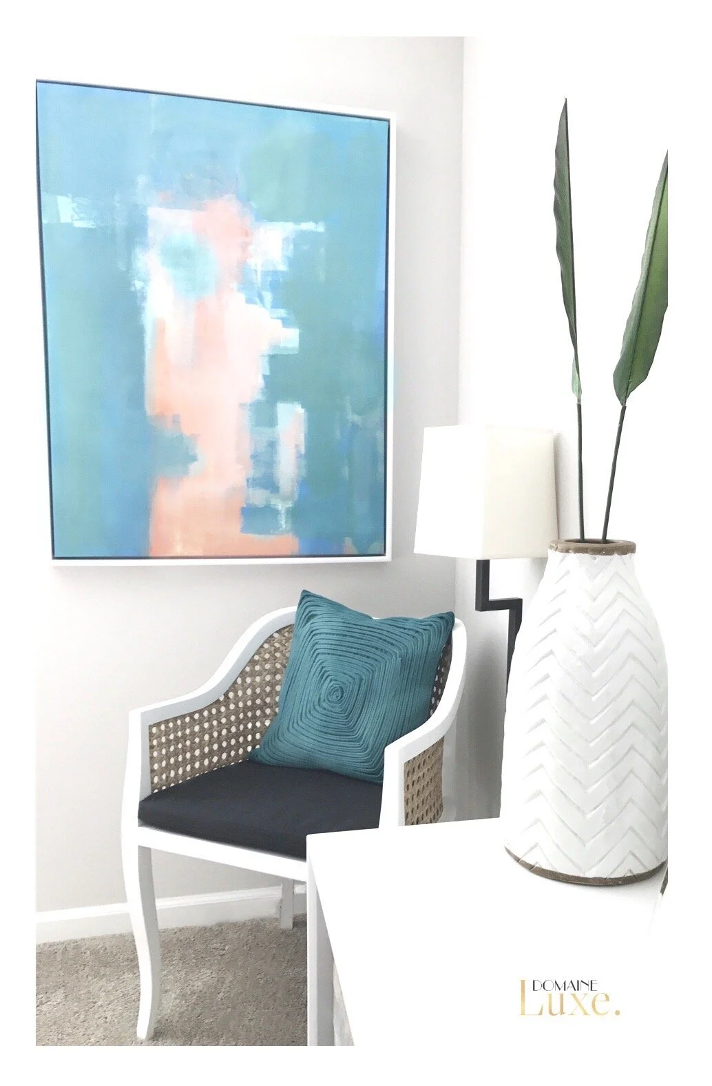
Aegean Teal in fine art.
What’s your relationship with color?
Are you a color lover? Do you want more color, but carefully edited? Are you color phobic? If you’re not quite ready, a great way to embrace the latest trend without committing to painting the walls, is to try out the color in an audition! We find having the color in spots to accentuate your space can help you get over your fears. The color in both of these modern paintings above feels inspiring. The art enlivens both of these otherwise neutral interiors. Once you love the color in your accent, art or accessories, you may find the strength to move forward in painting your walls with this newly discovered shade.
The Aegean Teal, Color Of The Yearr is shown here in accessories, you can see it mixes well with blues. .
Green blues make neutrals pop. We could have used pale gray pillows on this sofa above, but the COTY contrast and pattern play here adds a cool yet dynamic mix. We added a green aloe to carry the biophilic, wellness green vibe in this Delray Beach home.
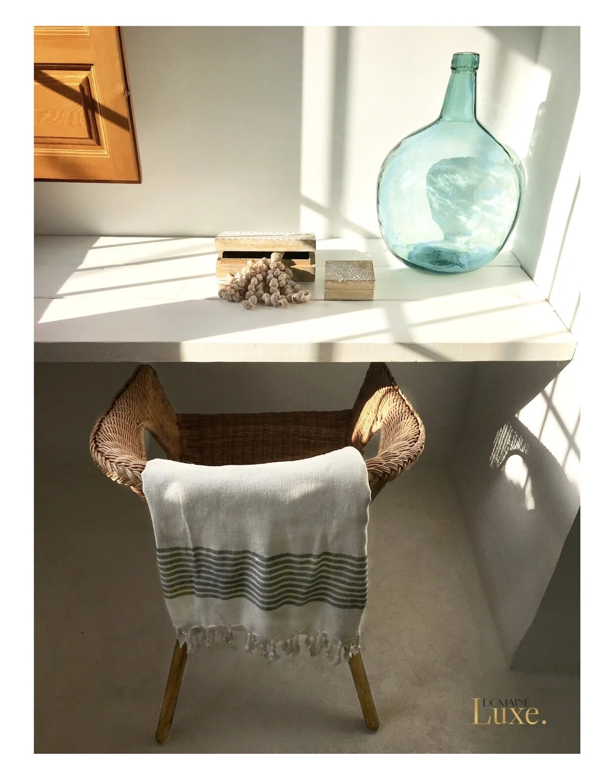
Further use of this hue in accessories shows its restorative calm. We were able to capture the essence of the vibrant sea with glowing glass in this rejuvenating color in an old fashioned Spanish wine jug, which speaks volumes at this beachfront bohemian home. The color simply works and fits in to many divergent color schemes. Our handcrafted yet simple accessories set the scene at this vacation spot. I love the sunset shining it’s last golden rays on this built in vanity desk in a guest bedroom in an unusual project we had the pleasure to work on.
Shades of this color in accessories and art mingle nicely with golden and warm natural toned wood.
This COTY provides a perfect backdrop for tea for two. Want to have a cup with me? Please…Reach out!
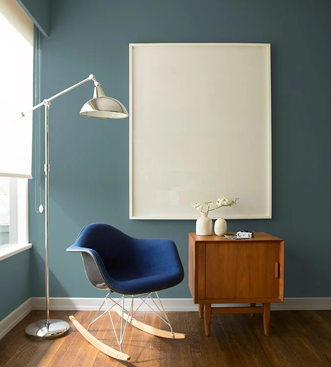
Aegean Teal on the walls. Photo, Benjamin Moore.
There’s something reassuring about this new hue for Color Of The Year. It has the calming properties of blue combined with the naturally renewing properties of green. It’s like the turquoise sea and cyan skies mingling together by the grassy fields. Day at the spa, anyone?
This teal color mixes well with brights and natural golden hues. What do you think of it? As mentioned earlier, teal is a tertiary color, and it’s opposite is the red-orange and red-purple tertiary hues. Opposites attract! It’s a playful blend in these Moroccan textiles, in an exotic inspired sitting area. To answer your question, why, yes, we did crack open the Champagne after the photo shoot! Cheers to loving color in your home and to loving our work. 🥂
here’s the Color Trends Palette for this year.
Stylish colors round out the palette. From perfectly pale neutrals, like Atrium White, to a lighter sunny disposition in Beacon Hill Damask, to a rich, deep cognac in Rosy Peach, it’s all here, combined for concordance in our interiors. Can you imagine these colors in your rooms?
Let’s Work Together on Adding Color to your home
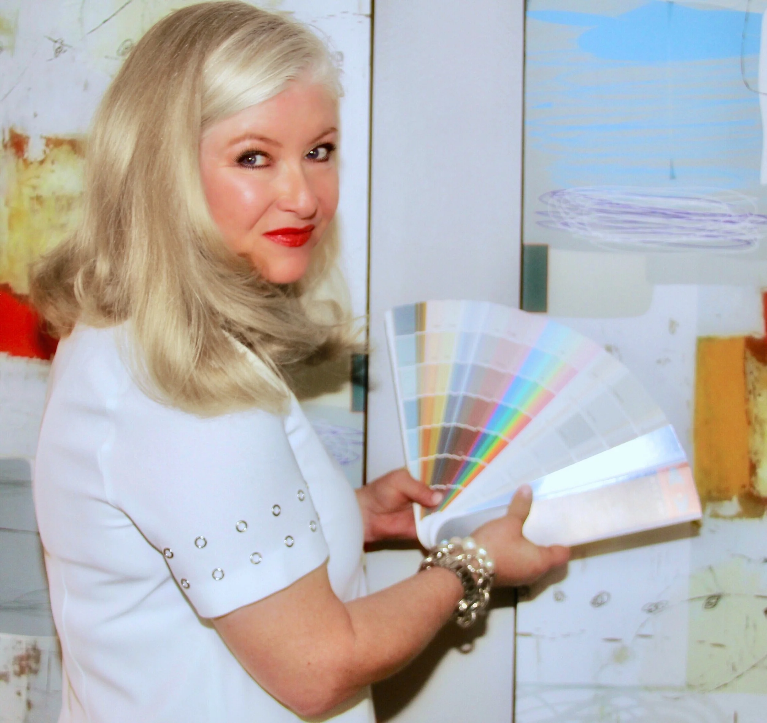
Want to know more about how color enriches and inspires our life? Have questions about choosing the right paint color that balances relevance with your furnishings, for a refresh or your next project? Getting color correct is something we are passionate about! We are Color Certified, and offer Color Consultations as we seek harmony at home for our clients. It’s all about having a stylized home that speaks to your personal dreams, turning your house into your intentional sanctuary. Let us save you time and from making costly mistakes.
Want to learn more about hiring an Interior Designer? View The Top Ten Reasons to Hire a Professional Interior Designer.
Thanks for stopping by. 😊
DOMAINE Luxe ( Domaine Luxe ) is a boutique interiors firm lin Delray Beach, Florida. Founded by interior, staging and color expert Denise Jadd, DOMAINE Luxe combines inspired design services with real estate luxury home staging services. The award-winning DOMAINE Luxe brings a different perspective to a design project through creativity, introspection, history & research. Denise has been featured in Forbes, Insider, Build, and Redfin. She is the founder of Professional Home Stagers Industry, judge of the International Home Staging Awards, and has been recognized as an industry leader by the IAHSP for the past two years running.
