Contact Us

Use the form on the right to contact us.

You can edit the text in this area, and change where the contact form on the right submits to, by entering edit mode using the modes on the bottom right. 

310 NW 4th Ave
Delray Beach, FL, 33444
United States

(561)738-4673

Domaine Luxe is an award winning, boutique Interior Design firm in Delray Beach, Florida. We create uniquely alluring, well designed, safe havens at home combining livable luxury and artfully curated spaces, exclusively designed for our clients who need a turnkey design process.

Blog

Filtering by Category: Staging

Domaine Luxe Awarded Architecture Award and Best Home Staging Firm in South Florida by Build

Denise Jadd

More award news for Domaine Luxe!

Domaine Luxe is one of the chosen recipients of the Architecture Awards and has been awarded Best Home Staging Firm 2023 - Southeast Florida.

The prestigious BUILD Magazine has confirmed that Domaine Luxe is one of the victors for Home Staging in 2023!

Read More

How to Pick Art When Staging Your Home

Denise Jadd

Domaine Luxe was recently featured in a Redfin article for our art expertise with more top pro advice when it’s time to prepare to sell your home! Here’s how to pick art when staging your home.

Read More

Biophilic Design Used in Interiors & Staging

Denise Jadd

The botanical influence in biophilc design by Denise Jadd, , principal Designer at Domaine Luxe!

The botanical influence in biophilc design by Denise Jadd, , principal Designer at Domaine Luxe!

🌿 Biophilic design is incorporating the use of your natural surroundings outside, and bringing that influence into your home design plan. The use of Biophilic design in homes and businesses has become a huge trend in the last few years, as it contributes to our wellness. It is a proven method to help us live, work, learn and thrive better!

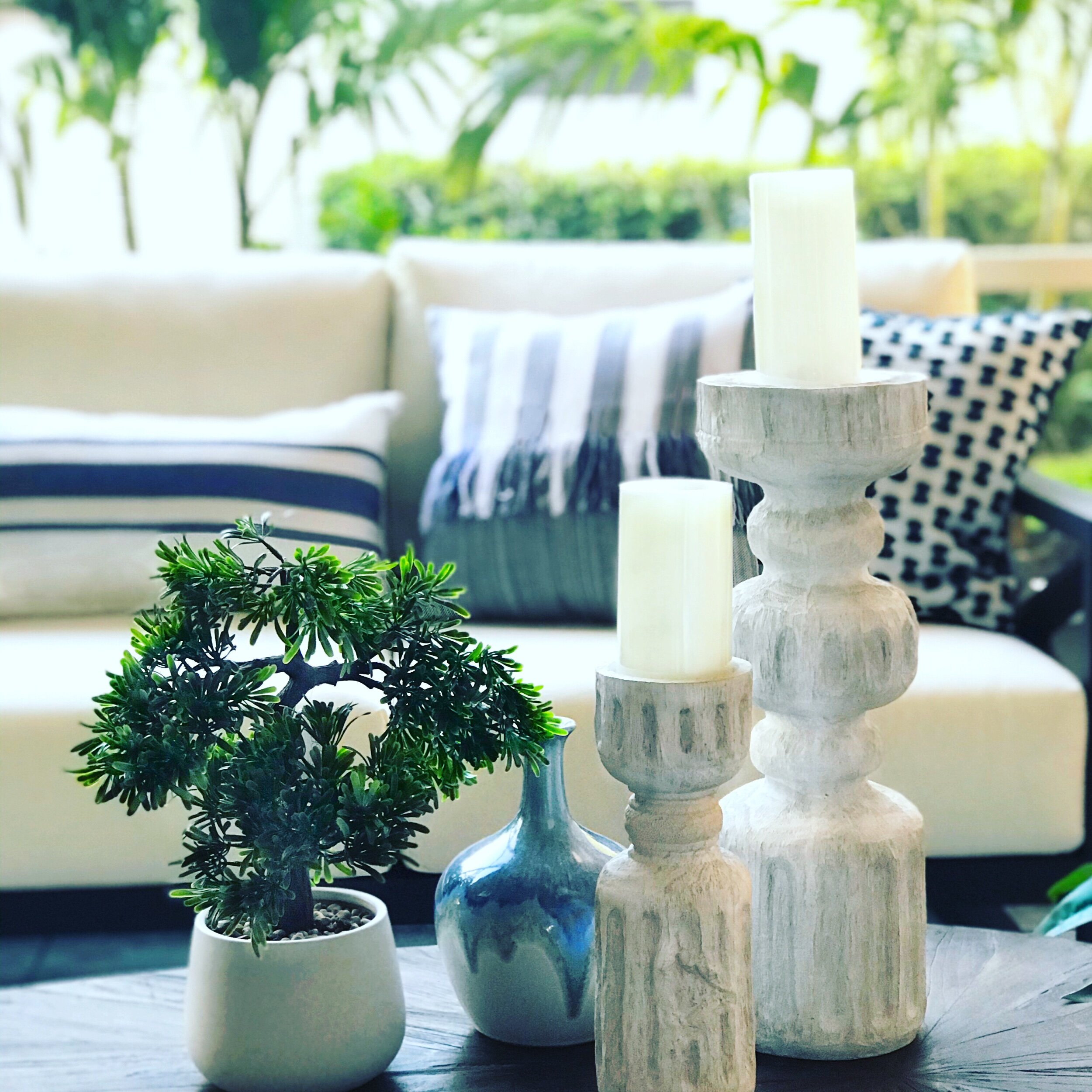
Biophilc staging technique on the patio.

Biophilc staging technique on the patio.

🌿 Setting the green tone in your home just makes sense, as we all want a connection to nature. It’s about instilling calm, a respite from our work, and our world’s industrialized, high speed hustle and bustle. It makes us slow down, take pause, and concentrate on and respond to nature. Like environmental psychology, and  neuroaesthetics, it’s naturally restorative. It can also aid in selling a home, just like in this outdoor living space we created in the photo above, where our staged home sold in just 1 day! With more of us at home and skipping travel this summer, this outdoor space doubles the home’s living area, allows for more freedom, vitality, and connection to the great outdoors. We have offered up this biophilic practice as a tip for helping others to stage their homes, and was just quoted by Redfin, the real estate portal, on this topic. Keep reading for more details on this.

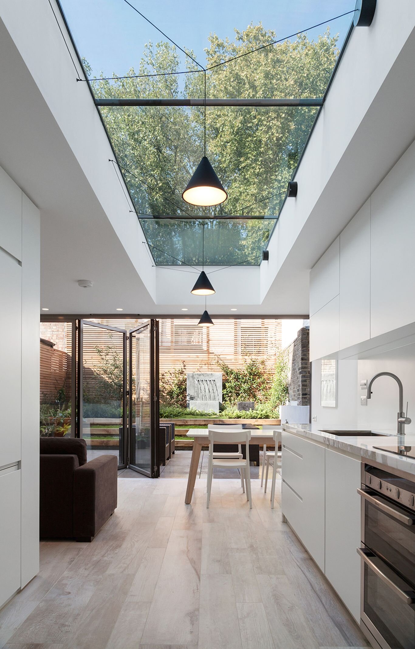
Image credit: Felipe Tozzato/Bolton Chalklin Architects

Image credit: Felipe Tozzato/Bolton Chalklin Architects

🌿 The biophilc concept defined reflects how it is used within the building industry, both public and academic spaces, commercial and residential real estate alike, to increase the occupant’s connectivity to the outside environment through the use of direct nature, indirect nature, and it’s natural conditions. This example above proves having these expansive, bifold doors and an enormous skylight illuminating your kitchen space is an architecturally adept way to merge your inside with your outside. The entire space becomes seamless, where the shell seems to be opening to the sky and beyond, exposing the great outdoors.

A beachy, seaside retreat, filled with natural woods,wood beams, organic lighting, is filled with biophilc design touches.

A beachy, seaside retreat, filled with natural woods,wood beams, organic lighting, is filled with biophilc design touches.

🌿 We like to use these techniques to make a house appear more homey. Organic elements, reflecting the outside trees, flora, and fauna combined with natural yet made into decor elements like the woven basket, wood table, rope and shells all contribute to this wonderful feeling. Here, we rely on a potted palm tree to hug a corner, defining the boundary of the space. On the weathered wood coffee table, a fresh heather blooms happily, graced by a few well chosen, seaside decor pieces, like the shell tassel and a glass, rope handled hurricane lantern. A touch of real plants naturally lifts our spirits as we feel connected to nature. .

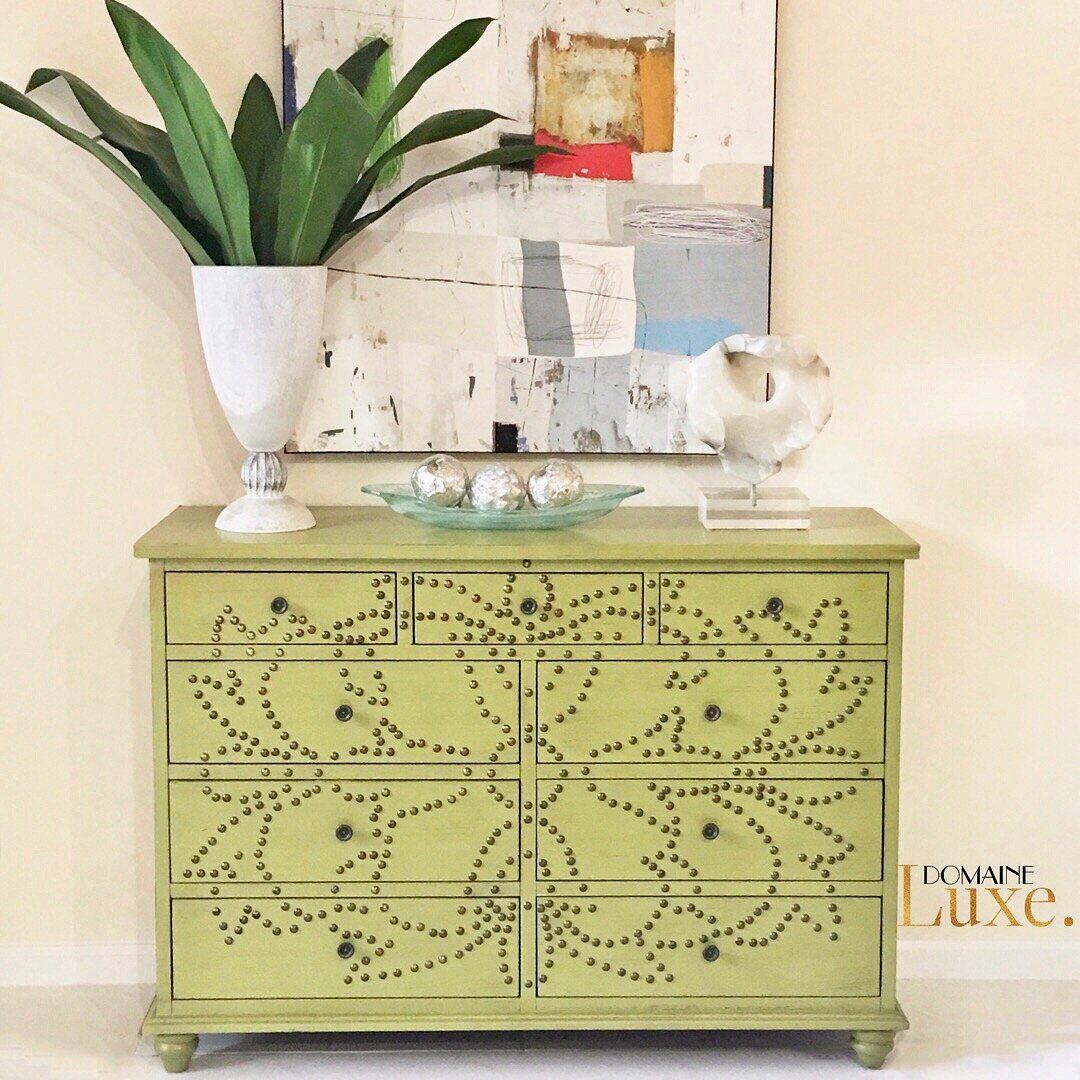
A Murano vase with floral leaves.

A Murano vase with floral leaves.

🌿 Well placed, simple greenery can be elegant and dramatic, especially in a Murano glass, one of a kind, handblown vase. The bold, metal detailed cabinet, offset by the quieter abstract painting, and fine marble sculpture, is gently enhanced by the fresh, green floral leaves. It can lead the eye through the surroundings, and direct the viewer for a specific experience or focal view.

Proteas on a dining room table.

Proteas and hydrangeas in a stoneware vase on a wood dining room table.

🌿 Some floral placement is integral to enhance the decor, and amplify the impressive, overall design results. The fresh proteas seem to be made for this abstract, mixed media floral inspired painting in this elegantly designed, classic modern dining room. Botanical linens on the table, or floral rug can carry the theme throughout.

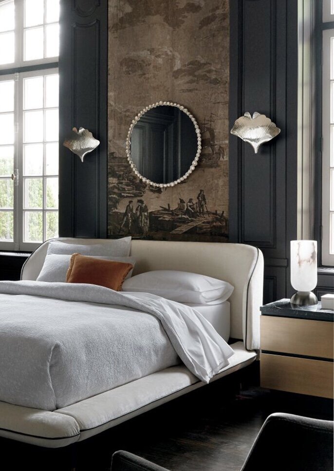
Floral ginkgo sconces grace the wall behind the bed. Image:: CB2.

Floral ginkgo sconces grace the wall behind the bed. Earthy wood tones mingle with moody walls. Image:: CB2.

A floral theme does not need to be in pattern, but it could be represented in shape. These ginkgo brass sconces gracing the wall behind the upholstered bed, are perfect to illuminate your sleep space, and there are many beautiful floral inspired chandeliers available now.

Biophilc art of mosses in a stainless steel box configuration and bold yet fun furniture graces this office by Domaine Luxe.

Biophilic art of mosses in a stainless steel box configuration, leaf sculpture, and leaf patterned white chair mingle with bold yet fun iron and wood furniture gracing this office by Domaine Luxe.

🌿 Having biophilic art in your surroundings can help you focus, especially in a work space. This stunning creation of varying mosses handset into steel boxes is by an artist and landscape designer we like to promote and use on our jobs, as above. Stephanie is based in Fort Lauderdale. Ask us for more information on her.

A green wall in a living space infuses life into this darker trimmed wall with gray ceiling great room by the kitchen. Green palm leaf wallpaper fills the niche behind the built in bench dining nook. A rounded glass wall on the right allows more light into the great room while the view to the back patio shows tree branches peaking through.

Perhaps it’s time for a green wall and planter to spruce up your space! Here a botanical wallpaper placed in the arched niche has a palm pattern, which is repeated in the live garden on left. Notice the rich mix of green upholstery and blonde wood tones all around, offset by a deep gray.

A light and bright living space is transformed by an organic design and color scheme and a few well placed plants.

A light and bright living space is transformed by an organic design and color scheme and a few well placed plants.

🌿 Other times, we can use one perfectly large, green leaf displayed in a mod vase to convey the feeling of nature. Limit the window treatments, open the doors, and welcome the pretty view and let sunshine in.

As mentioned above, we are happy to share we got quoted about using Biophilic Design in staging in a recent article, which appeared on Redfin, “Staging A House On A Budget”. Here is the quote:

Incorporate biophilic design. This design approach seeks to connect the outdoors with people indoors. Open all your window treatments, let in the sunshine and the view, and bring the relativity of nature in with a few, well placed live houseplants, or fake, silk trees to set the green tone. This enhances vitality and psychological wellbeing, as buyers judge homes with all of their senses. Just be sure to avoid heavily fragranced plants or flowers because some people are sensitive to strong scents. It pays to be green in staging, as gorgeous greenery will always be in fashion. 

See the full article “Staging A House On A Budget”, here.

🌿 Make it a beautifully, biophilcally designed day, keeping it green!…💚
- Denise xo

Adjustments.jpeg

Thanks for stopping by.

DOMAINE Luxe ( Domaine Luxe ) is a boutique interiors firm located in Delray Beach, Florida. Founded by interior and staging expert Denise Jadd, DOMAINE Luxe combines inspired design services with real estate luxury home staging services. The award-winning DOMAINE Luxe brings a different perspective to a design project through creativity, introspection, history & research.
Denise is the founder of Professional Home Stagers Industry, judge of the International Home Staging Awards 2020, and has been recognized as an industry leader by the IAHSP for the past two years running.

Staging a House on a Budget: Tips from the Experts

Denise Jadd

We are pleased to be featured in the following staging tips article. Enjoy this informative excerpt repost from Redfin!

When it comes to selling your house, appearance is everything. Home staging is an art designed to show off your home in its best light, and because of that, it can make all the difference. But what do you do if you don’t have a large budget set aside for home staging?  

Don’t worry yet, we have good news! Fortunately, whether you’re renting out a condo in Portland, OR, or selling your home in Atlanta, GA, staging a house on a budget is a totally viable option. To help you get started, we asked expert stagers from across the country to share some quick and easy ideas that will make your house look great (and more importantly won’t break the bank).

file-C60A485F-D26B-40EE-94E2-7C1A3F26E3BD.png

Showcase what made you fall in love with the house. If you’re ready to sell, ask yourself: what made you fall in love with your house? Most likely those things will be the ones that attract buyers. Make sure those areas are cleaned up, de-cluttered, and emphasized so they shine and wow buyers. – Style Fusion Home Staging

Remove excess furniture. While many people want to display the many possibilities for each room, it is critical to keep a clean and open layout. Removing any excess furniture reduces clutter and opens up the airflow. Too much furniture can shrink an area dramatically and hide the true space of the room. – The Staging Tree

Try virtual staging. The most efficient and cost-effective way to stage any room in less than 24 hours (with zero furniture) is with virtual staging. On-demand virtual staging provides sellers the unfair advantage in the marketplace that will allow them to display any space in various setups and styles. – LRB Design Studios

Stage with items from the grocery store. When we’re staging homes, our final step is a trip to the grocery store. We generally stock up on 6-12 bottles of Pellegrino and attractive cans for the pantry area, a bowl of limes, and some margarita mix for a wicker cart. – Zesty Staging

Keep color and style consistent throughout the home. When color and style are a common thread throughout the home, buyers are more emotionally comfortable and connected. The use of no more than three main colors (use slipcovers on furniture if necessary, especially if they are well ‘loved’), and one style (be it transitional, modern, contemporary, western, traditional, etc.), will do the trick! – The Efficient H.O.U.S.E

Hang neutral subject artwork. A cost-effective way to hang neutral subject artwork is to buy inexpensive IKEA “Ribba” picture frames (24″ x 35″) and insert leftover wallpaper or fabric that you (or friends) may have on hand that coordinate with your home’s color scheme. For impact, hang two or three frames together approximately 5-6″ apart above a sofa or on a large wall. – Mackenzie Creative Home Staging

Switch out personal photos with scrapbook or wrapping paper. If you already have picture frames hung up, a great way to cover up personal or family photos is to use scrapbook paper or even neutral wrapping paper as inserts. Choose muted colors and patterns that coordinate with your space. Simply cut the paper to size and insert it into the frame, covering the current photo. – My Nest Is The Best 

Address visual clutter. The biggest reason people give for moving is a lack of space in their current home, so selectively prune anything that distracts buyers from seeing the great features of your home. Stacks, even if neat and straight, add weight and visual clutter to rooms. The Dezign Zoo motto is “when in doubt, take it out.” – Dezign Zoo

Paint the front door. A quick and inexpensive way to increase curb appeal is to give the front door a fresh coat of paint. Choose a bold, contrasting color that will stand out and immediately draw the buyers’ eyes to it when they pull up to the house. Black is always a winner, or you could choose a bright, trending color like turquoise, yellow, or orange. – Larimar Home Staging

Stage an extra bedroom as a home office. Since so many of us are now working completely from home or more remotely, this tip can go a long way in appealing to today’s buyers. With this, you want to make sure everything flows and is as open as possible to create a positive and uplifting working environment. For a budget-friendly office, sometimes simpler is better. There’s no need to go overboard with accessories and desk decor, clean and fresh is the way to go. – Universal Staging Company

file-05285D75-71A1-401F-A7CA-8689EC5DA1E7.png

Have matching lamps and side tables. A great low budget tip is to have matching lamps and side tables in the primary bedroom so it feels and looks expensive. Staging isn’t about pretty, it is about creating value in the buyer’s eye. – Ask for Staging

Declutter. Spend at least a few weekends to completely declutter closets (we want to see baseboards!), pantries, cabinets, and bookshelves. Take closets down by 50 percent, remove magnets from the fridge, etc. If you aren’t convinced if something is de-cluttered enough, take a photo and see if it still looks cluttered through a camera lens – Curly Willow Design Studio

Remove all small appliances, toys, magazines, and pet items. – Utah Elite Staging

Incorporate biophilic design. This design approach seeks to connect the outdoors with people indoors. Open all your window treatments, let in the sunshine and the view, and bring the relativity of nature in with a few, well placed live houseplants, or fake, silk trees to set the green tone. This enhances vitality and psychological wellbeing, as buyers judge homes with all of their senses. Just be sure to avoid heavily fragranced plants or flowers because some people are sensitive to strong scents. It pays to be green in staging, as gorgeous greenery will always be in fashion. – Domaine Luxe

Make the floors sparkle. Open up your space, let the light in and clean it up. It starts with your floors; if you have hardwood floors and want them to sparkle, mix up some of your household items, 1 cup white vinegar, 2 tablespoons olive oil, distilled water, spray, and rub. – DDG DESIGN STUDIO

Buy cheap Goodwill books for shelves and coffee tables. Book selection is critical because when people see a book it tends to invoke thoughts and feelings. When staging a downtown condo, I want to see big coffee table books that are focused around modern art, the city where the condo is located, or an interesting modern photography book. Oftentimes I will see a cartoon or comic book as these are common coffee table books but it’s hard for the buyer to envision their new upscale living with a cartoon book. I also like bookshelves to contain thought-provoking books and avoid anything controversial. – Vize Virtual Staging

Style the front hallway. The front hallway is the first impression for your home when buyers walk in. Get it right. Add a mirror for a great reflection of light and to make the foyer seem larger, add fresh flowers like roses or lilies. First impressions count. – Margery Wedderburn Interiors

Freshen up a room with a new coat of paint. If you don’t need a lot of paint and are maybe just doing an accent wall, many local stores like Home Depot have discounted paint cans from incorrect orders – whether it was the wrong finish, incorrect tint, or something else. These ready to use paint cans can be heavily discounted – even as little as $5 per gallon. – Roomhance

Use fluffy white towels. I always recommend new fluffy white towels in master bathrooms. White denotes cleanliness, and fluffy towels add a fresh spa-like feeling to the bathroom. Towels are inexpensive and can be purchased at any large retailer, plus the seller can use them again in their brand new home. – Lenko Design

file-5B97B14A-A9C1-4A07-B2F7-E5DBC9C56AE1.png

Take great listing photos. 90 percent of homebuyers start their search online. To make sure your photos look great, take a picture of your exterior and every room – this is what potential buyers will see. Add and edit your belongings until the photos look worthy of a compelling listing photo. – House Candy Home Staging

Buy new, neutral throw pillows for the sofa and large accent chairs. Most of us have dark furniture because it hides more everyday use, but it also photographs poorly and can make a room look small and dingy. By adding new fluffy throw pillows to your furniture, it will update the room and brighten up the space. – The Staging Team

Depersonalize your home. Depersonalizing and decluttering makes a world of difference when selling a home that you’re living in. Keep the staging neutral and bright to help the home appeal to as many potential buyers as possible. – Witty Rentals

Creating a soothing sanctuary. The master bedroom is where we spend 1/3 of our lives, so why not make sure it looks soothing, clean, and stylish. Add solid white bedding (avoiding busy patterns) and layered pillows while removing excess furniture and clutter. A well-staged master bedroom helps showcase an inviting and calming feel for prospective buyers, making someone feel like they can move right in. – Step By Stage Interiors

Float furniture away from the walls. The way you choose to arrange your furniture can dramatically change how big or open a room feels. Sellers shouldn’t be scared to float sofas and armchairs away from the wall, as long as they are placed parallel to one of the walls in the space. This is especially effective with open floor plans, where the placement of a large sofa between two spaces can help define the separate living spaces. – Jodi Maturo Design

Make easy changes in the bathroom. Remove all floor rugs in the bathroom as it makes the floors look bigger. Add a small succulent or white orchid next to the sink. Your go-to towels are white, fluffy, and crisp — new hand towels will give a spa-like ambiance. – Maple&Moss

Arrange table lamps and floor lamps in a triangular configuration. Doing so spreads light evenly throughout the room. If you can’t add a third light consider hanging a clean-lined mirror on the wall to bounce additional light and open up the room. – Synergy Staging

Update your cabinet hardware. If you don’t have the time or resources to update your kitchen by replacing or painting cabinets, consider switching out your hardware instead. Updating your cabinet hardware to something more modern does wonders for your kitchen while keeping your project extremely budget-friendly. I recommend using a matte black pull and purchasing from Amazon to keep the cost well under $100.00. – Homeslice Studios

file-91B9882B-8C57-4EE6-8BC1-6F3FF4B2E3B5.png

Create a kitchen that feels spacious and functional. Whether you’ve got a massive kitchen with a large island or a smaller galley-style space, all homebuyers will be looking for a kitchen that feels spacious and functional. Keep countertops cleared off so they seem more expansive. I like to keep my staging items to a minimum: a large bowl of fruit, maybe a tall, simple display of flowers or branches if there’s an island. If there are open shelves or glass-fronted cabinets, keep your color scheme neutral and monochrome. It will make the space feel clean and cohesive. – A Simpler Design, Dallas based stylist and furniture painter

Add flowers. A simple (and cheap) bouquet from a grocery store or some stems from the backyard is all that’s needed to add brightness to any home. The key is to choose the tallest stems that can be found and pair it with a large, clear vase for that look of sophistication while adding that perfect homey touch. – MM Decor

Try alstroemeria flowers, they look fresh and can last two weeks. They also look great for MLS photos and showings. – Preston Interiors

Only stage the key rooms. The key to saving money with staging is to only stage the key rooms. If it’s an occupied home try to use as much of what you already have, then throw in what’s needed to complete the job. – Lancaster Home Staging And Design

Let the light in. Good lighting is so important in making a home look and feel great to buyers. Take down any unnecessary window treatments to allow as much natural light into the home as possible and introduce some artificial lighting into each room with additional floor and table lamps. Light helps a space feel much larger and more open. – DL Custom Designs

Visit second-hand stores to find unique and low-cost pieces. These budget-friendly stores can help homeowners design inviting spaces for both their property listing photos and open houses. The trick is to be creative and think outside their personal decor preferences when shopping. – In Good Design

Focus on color. Color is essential when it comes to staging your home. We advise sticking with warm, neutral colors for painting. Lighter shades are not only more attractive to the eyes, but it helps buyers to visualize their own household items in the house. - Stone House Stage + Design

Incorporate fresh greenery. Fresh cut greenery can go a long way to enhance the decor of a staged home.  If you live in a tropical area, Palm leaves placed in a clear glass vase look amazing on a coffee table. Other greenery that can be used is Eucalyptus, Fern, or Fiddle Leaf Fig stems. – Di Leo Design & Staging

Originally published by Redfin

Article Written By Emily Huddleston

Link to Original Article: https://www.redfin.com/blog/staging-a-house-on-a-budget/


If you would like to profit from a Pre-Market Evaluation, a powerful marketing tool, reach out to us here at Domaine Luxe, before you list, to maximize your potential on your biggest investment.

Interior Design Luxury 3D renders That Feel Like Home

Denise Jadd

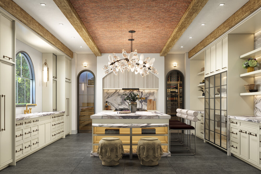
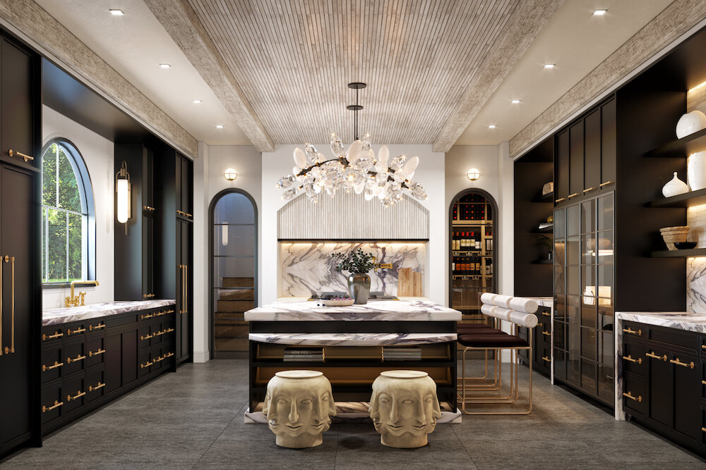
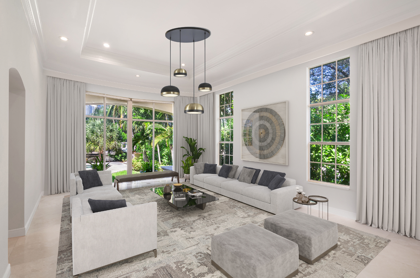
Luxury 3D Render by Domaine Luxe shows the potential of space.

Luxury 3D Render by Domaine Luxe shows the potential of space.

Is it starting to look up with this uncertain real estate market? Here’s something we thought could be an opportunity for clarity:

We create hyper-realistic, three dimensional photographic images, or
Interior Design Luxury 3D Renders, that feel like home.

It’s not only for our home sellers, investors and builders, but also for our Realtors, whose clients may be hesitant to buy or sell now.

Domaine Luxe has always offered Luxury 3D Renders for our design clientele with full service Interior Design projects. With renders, both buyers and home owners can visualize how a room could be, how the space and scale will flow, and how it will function. The colors, finishes, fabrics, furnishings and lighting, joined with our on trend designer touches implemented into the floor plan, help clients imagine the potential of an empty or dated space. As we know, these neglected rooms don’t convey much emotion. The results are about beauty and practicality, and in the real estate market, it combines together for the buyer to envision the space as their very own.

Three dimensional rendering uses CAD (computer-aided design), or computer graphics that represent mathematical data in the process of converting a 3D model of shapes into images that are 2D digital images on a computer. When coupled with great design, that’s a whole lotta tech for an artistic representation brought to life. 

Interior renderings are defined as images where the vantage point or viewing angle is located inside of the structure or house. 

We start the process by determining the details of the project and it’s desired outcome; we gather floorplans, CADs, and photos of the space, with different camera angles showing alternative view options and perspectives. The next step is we get to work on the design plan sourcing finishes and decorative elements to be implemented. This is needed at the beginning for illustrative purposes. This can take some time, from days to weeks depending on the scope of the work. Then we create a “Clay”, or a white space.

The Clay before finalizing shows different perspective angles.

The Clay before finalizing shows different perspective angles.

Once the shape of items are placed into the floorplan, the modeling takes form. Reflection, shading and texture are what makes these renders pop. Materials shimmer, and wood tones look richer. Illumination and how the light is transported, with the increased ability of depth visibility is the final product. Daylight, sunset, or nighttime can be experienced as it comes to life. Which mood do you prefer? The 3D is from the perspective, and we achieve great views. Long rooms can be seen from far away. Rendering generating times can be several days for in depth, complex rooms.

Renderings are usually created for presentation, marketing and design analysis purposes.

  • Still Rendering

  • 3D Walk through and fly by animations (movie)

  • Virtual Tours

  • Floor Plans

  • Photo realistic 3D Rendering

  • Panoramic Renderings

  • Light and Shadow Rendering

  • Renovation Renderings 

It also enables clients to make design related decisions well before the property is actually built, or before demo begins. This aids in experimenting with building design and its visual aspects.

When looking at the room below, you can see how viewing two alternative plans with slight differences can truly help to form an opinion about which design a homeowner might want to choose to live with. Which design appeals to you more?

Luxury 3D Renders done to our highest design standards could be just the right solution for sellers! Differentiate your listing with Domaine Luxe’s high quality architectural and Interior Design Luxury 3D Renders modeled for your property, lavished with exquisite designer details and artistic textures. This is not like the average, commercial virtual staging, these renders are finished with high end, to the design trade only, bespoke furnishings. Everything is custom designed around the aesthetic of the space and what the house needs to help prove and show off its worth.

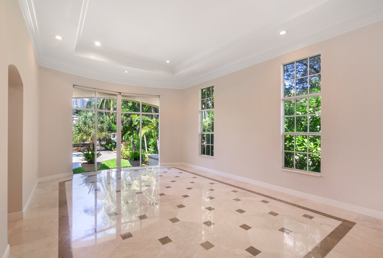
3D renderings play a major role in real estate marketing and sales. In this example, when looking at the room below, which listing photo would be easier for you to sell?

Remember, we can help you Virtually, with Vacant and Occupied listings.

Let’s chat over a cup of tea about Luxury 3D Renders for your Virtual Home Staging to convey the right feeling of home. Call us now. We look forward to collaborating on the success and the journey of your listing!

Make it a beautifully designed day!

Home Staging Pre-Market Evaluation

Denise Jadd

Prior to listing your property you should consider hiring a Home Stager for a property consultation.

The first step is calling us, your DOMAINE Luxe Stager, certified experts in real estate visual marketing.

Read More