Discover the Cinnamon Slate Warmth with Benjamin Moore's 2025 Color of the Year
Denise Jadd
How to use Cinnamon SlatE, A Designer’s perspective: Benjamin Moore's 2025 Paint Color of the Year
Benjamin Moore's 2025 Paint Color of the Year: Cinnamon Slate - A Palm Beach Interior Designer's Perspective
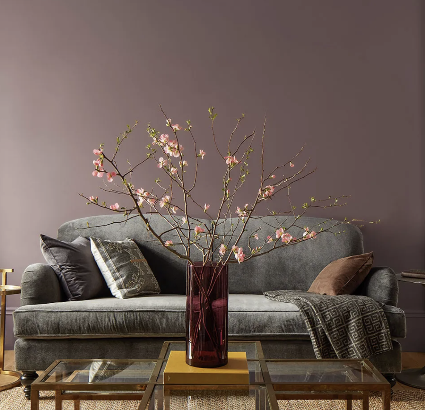
Serene living room with walls painted in Benjamin Moore's Cinnamon Slate, the 2025 Color of the Year. The rich color creates a calming atmosphere, complemented by a cool steel gray velvet sofa accessorized with pillows in gray and brown. Notice how the cool and warm color palette works together. Warm brass tables and a warm toned natural jute rug contrasts the coolness. A golden book is topped with a burgundy glass vase filled with pink apple blossom branches, adding more warmth and a biophlic touch, bringing the outdoors in.
Benjamin Moore has unveiled its Color of the Year for 2025: Cinnamon Slate (2113-40), a sophisticated purple hue that combines heathered plum and velvety brown tones. As a Florida interior designer and Benjamin Moore Color Certified professional, I'm excited to explore how this rich paint Color of the Year (COTY) can transform homes and create inviting atmospheres.
The Allure of Cinnamon Slate for Palm Beach Locals
COTY Cinnamon Slate (2113-40) is a versatile dark and dusty violet color that offers both depth and warmth, making it perfect for creating cozy yet elegant spaces. With an LRV (Light Reflectance Value) of 19.71, this color absorbs more light than it reflects, resulting in a rich, enveloping ambiance. LRV is used by interior designers, to measure paint’s light on a scale of zero to 100 where zero is absolute black, and white is 100.
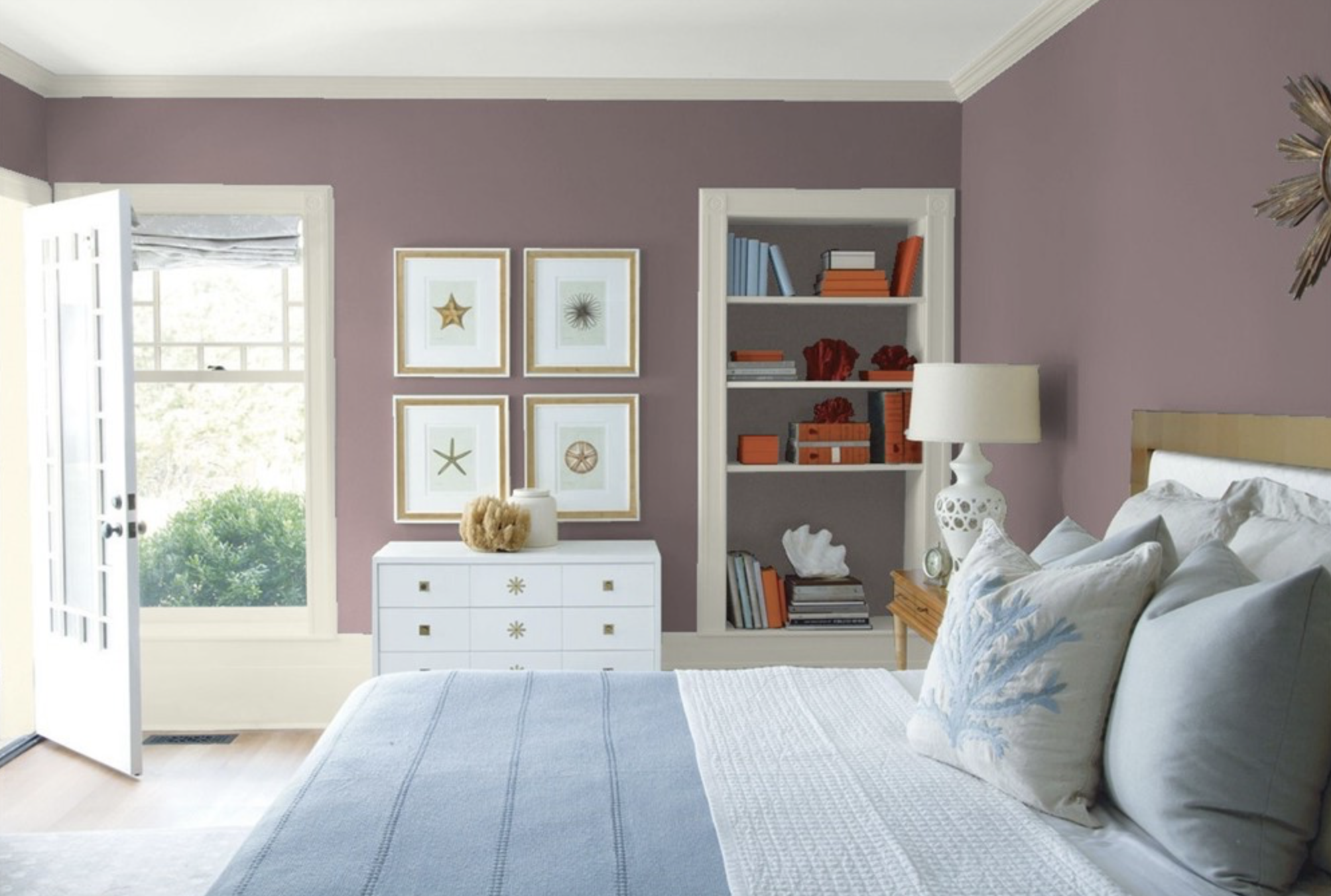
Beachy bedroom with walls painted in Cinnamon Slate. A sleek dresser in white contrasts with the darker Cinnamon Slate walls, while a comfortable bed trimmed in wood and upholstered in a white fabric, is covered with a light blue and crisp white bedding. Coastal touches makes this bedroom Palm Beach ready.
This unique characteristic allows Cinnamon Slate to adapt beautifully to various lighting conditions, revealing different cool and warm undertones throughout the day. In brighter spaces, its subtle cool gray hints may emerge, while in dimmer settings, warmer, deeper burgundy to brown tones can come to the forefront, creating a dynamic visual experience.
This interplay of light and color makes Cinnamon Slate not only a sophisticated choice for walls but also an excellent option for cabinetry, as seen in the kitchen below, furniture and decor pieces, allowing homeowners to play with textures and finishes. The color's warm undertones can enhance the natural beauty of wood floors and complement a wide range of decor styles, from modern minimalism to traditional elegance. By incorporating Cinnamon Slate into your design palette, you can create inviting spaces that feel both luxurious and welcoming, making it an ideal choice for any room in the home. Let’s delve in!
Key Characteristics:
Depth: The color's complexity adds dimension to any room
The layered warm and cool tones of Cinnamon Slate create visual intrigue that goes beyond traditional neutrals. Its sophisticated blend of a dusty, heathered plum with hints of gray and velvety brown allows the color to shift subtly throughout the day, revealing different nuanced characteristics depending on lighting and surrounding elements.
This modern classic living room is painted in Cinnamon Slate, the 2025 paint COTY from Benjamin Moore. It blends beautifully with the neutral and modern furnishings, a feminine accent of a peachy pink billowing on the window drapery, and striking arches and moldings in a crisp white. The dynamic color interplay is definitely evident here, with its utter chic dimension in this light drenched living room.
This modern classic living room is painted in Cinnamon Slate, the paint color the year from Benjamin Moore. It blends beautifully with neutral furnishings and crisp white moldings.
Versatility: Suitable for various design styles, from modern to traditional homes
Cinnamon Slate transcends design boundaries, seamlessly integrating into contemporary minimalist spaces and classic traditional interiors alike. Its chameleon-like quality enables designers to use it as a foundational color that can be styled up or down, making it an incredibly adaptable choice for diverse aesthetic preferences. From subtle and calm to dramatically bold, from Art Deco style, to new modern traditionalist, to mid-century to minimal modernist modalities, it seems to transcend time and boundaries.
Warmth: Creates a welcoming atmosphere ideal for Palm Beach and Florida homes
In the bright, sun-drenched environments of Florida, Cinnamon Slate provides a grounding, comforting presence that counterbalances intense natural light. The color's inherent warmth mimics the rich earth tones found in Florida's natural landscape, creating an immediate sense of connection and relaxation within interior spaces.
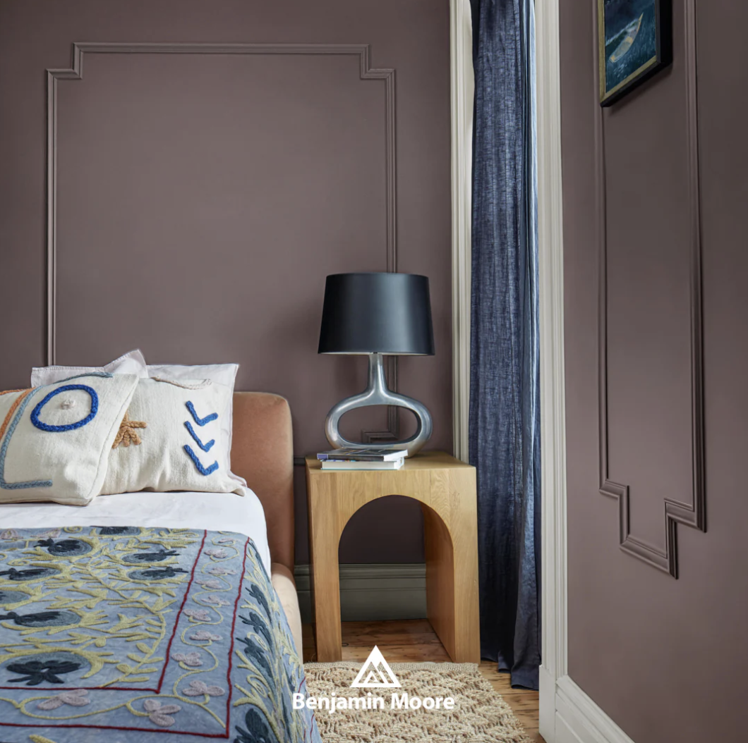
Photo credit: Benjamin Moore. Serene bedroom designed with a calming palette of neutral and blue tones featuring Cinnamon Slate on the walls, crisply defined by white wood casings and baseboards. All the textiles add color and contrast to the backdrop of the wall color. The bed is dressed in decoratively embroidered bedding featuring soft white and blue layers, complemented by the various textures and plump artistic pillows. The warm peachy velvet bed and warm wood side table with a richly textured neutral rug underfoot, add a warm contrast to the blues, while the metallic modern lamp adds shine.
Color Pairings
Cinnamon Slate's nuanced undertones allow it to harmonize beautifully with both vibrant and muted palettes. Consider pairing it with:
- Cloud Cover (OC-25): A light neutral for balance
This soft white creates a perfect counterpoint, allowing Cinnamon Slate to shine without overwhelming the space. The combination provides a clean, sophisticated backdrop that enhances the depth of the primary color.
- Porcelain (2113-60): A lighter shade in the same color family
By selecting a color from the same family, designers can create a cohesive and elegant color story that feels intentional and refined. The subtle variation adds visual interest while maintaining a sense of harmony.
- Chambourd (AF-645): A deep, rich accent color
This bold pairing creates a dramatic contrast that elevates the sophistication of the color palette. The interplay between Cinnamon Slate and Chambourd offers a luxurious and dynamic design approach.
Cinnamon Slate Pairs well with the above listed colors to bring any room together in a modern and elegant style.
Stylish entrance hall with walls painted in Benjamin Moore's Cinnamon Slate. A wood settee with cushion and pillows covered in a soft neutral tone stripe crisply contrasts with the rich walls.
How to Use Cinnamon Slate in Room Applications
1. Living Rooms: Use Cinnamon Slate as an accent wall to create a focal point
The rich depth of Cinnamon Slate transforms an ordinary living room into a sophisticated space that draws the eye and sparks conversation. The welcoming and warm color palette beautifully sets the scene, allowing your guests to feel entirely comfortable and completely at ease in a living space that exudes subtle elegance. Surrounded by its sophisticated walls, this inviting environment serves as a perfect backdrop for entertaining at home, enhancing every gathering with style and grace. This inviting color also beckons the entire family to unwind and fully relax at home, creating a serene atmosphere that promotes comfort and tranquility. By strategically placing this color on a single wall, designers can create visual drama without overwhelming the entire room, allowing other design elements to shine.
Cinnamon Slate painted as an accent wall in a living room can create a focal point for neutral gray and blue furnishings, adding some drama to the surroundings.
2. Bedrooms: Paint all walls for a cocooning effect
Cinnamon Slate envelops the bedroom in a deep sense of tranquility, creating a beautifully serene retreat that feels both intimately cozy and luxuriously inviting. The subtle color tones add a layer of calm that enhances serenity and promotes restful sleep. The color's complex undertones provide a psychological sense of comfort, helping to reduce stress and promote relaxation in the most personal space of the home. Notice how grounding this rich COTY is in the bedroom below.
This modern bedroom is a perfect example of Cinnamon Slate warming up a bedroom, and grounding the space for the bed. The pale floors contrast with the depth of the wall color, with the modern Palm Beach style infused with white and touches of classic blue and a pop of orange in the art. .
3. Home Offices: Apply to built-in shelving for a sophisticated backdrop
Using Cinnamon Slate on built-in shelving adds depth and professionalism to a home office environment, creating a sophisticated backdrop for video calls and work sessions. The color's versatility allows it to complement both traditional and modern office furnishings, making it an ideal choice for creating a refined workspace.
Create Contrast with Paint color
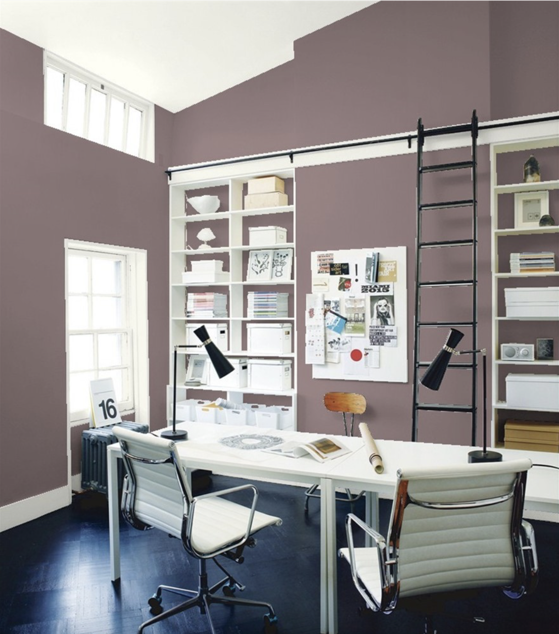
The chic office comes alive with Cinnamon Slate paint on the walls and in the built in shelves back,
Cinnamon Slate transforms this otherwise white office, infusing it with a burst of excitement and energy. The rich, warm hues of Cinnamon Slate creates a striking contrast against the minimalist backdrop, elevating the overall aesthetic of the space. This vibrant layering not only enhances the visual appeal but also instills a sense of warmth and creativity, making it a stimulating environment for productivity. The dynamic interplay between the Cinnamon Slate and white surfaces serves as an inspiring setting, welcoming collaboration and innovation while maintaining a chic atmosphere.
4. Dining Rooms: Create an intimate atmosphere for gatherings
Cinnamon Slate elegantly transforms dining rooms into warm, inviting spaces that naturally encourage lingering conversations and memorable gatherings among family and friends, creating an atmosphere that fosters connection and cherished moments. Its rich, deep tone creates a profound sense of intimacy that makes every meal feel like a truly special occasion, beautifully bridging the gap between everyday dining experiences and elegant entertaining moments. Consider using the COTY Cinnamon Slate as a trim to the dining space.
The Impact of Paint Color in Interior Design
As a Florida interior designer, I've seen firsthand how the right paint color choice can transform a space. Cinnamon Slate offers a unique opportunity to create rooms that are both on-trend and timeless. Its rich color undertones provide a perfect backdrop for Florida's natural light, creating spaces that feel both grounded and airy.
This Cinnamon Slate color's sophisticated blend of heathered plum and velvety brown not only enhances the aesthetic appeal of a room but also evokes a sense of comfort and warmth, making it ideal for creating inviting environments in homes. Furthermore, its versatility allows it to be used across various design styles, from contemporary to traditional, ensuring that this paint color can adapt to the unique character of each home.
Whether used as a bold statement on an accent wall or as a subtle hue in decor throughout an entire space, Cinnamon Slate invites creativity and encourages a harmonious flow that resonates with the essence of Florida living.
The room with its lounge chair in calming Cinnamon Slate paint color, is furnished with comfortable, ergonomic seating adding light to this dramatic spot.
Color in Decor
Whether you’re looking to add depth and drama to your space or create an oasis of pale and soft feeling in your home, the color Cinnamon Slate can be used on both walls and in decor. Here, the living room with soft gray sofa, Cinnamon Slate and gold multicolored accent side tables and neutral rug adds a sleek, darker welcoming feeling.
This beautifully designed bedroom with a three piece artwork in shades of Cinnamon Slate, with lilac, brown, pink, purple, and white hangs above the bed, adding a bold splash of color that complements the soft, neutral tones of the upholstered headboard, bedding and light colored walls.
Cinnamon Slate is seen here in more decor, too. The sophisticated bedroom captures the rich effect of Cinnamon Slate on the walls, paired with soft beautiful, bedding in lighter colors that’s detailed with trim and beads with natural light filtering through sheer ribbon trimmed curtains. The colors pair well together in this well designed color palette.
Contemporary kitchen with dark cabinets, and walls painted in rich Cinnamon Slate, creates a warm and inviting atmosphere. Wooden countertops displays an array of richly hued plates and bowls in teal, lilac, purple and peach, adding vibrant pops of color against the dark backdrop.
FAQ: Choosing the Right Paint Colors for Your Home
1. How do I choose a paint color that will complement my existing furniture and decor?
As an interior designer, I always recommend starting with your existing finishes, furnishings and decor when selecting a paint color. Look for inspiration pieces such as artwork, rugs, or fabrics that you love and pull colors from those. This ensures that your new paint color will harmonize with your current aesthetic.
To test potential paint colors, use large swatches or sample pots to paint sections of your wall. Observe how the colors look in different lighting conditions throughout the day. Remember, it's easier to choose paint to match your decor than to choose decor to match your paint, so don't rush this decision.
The luxurious bathroom features walls painted in elegant Cinnamon Slate paired with chic fixtures and ambient lighting to create a memorable retreat.
2. What paint colors work best for small spaces to make them feel larger?
In small spaces, lighter colors tend to make rooms feel more open and airy. Cool whites, soft blues, and pale greens can create an illusion of more space. However, don't be afraid of darker colors if that's your preference - they can add depth and coziness to a room, as seen this with this year’s COTY, Cinnamon Slate.
Consider the function of the space and the mood you want to create. For example, a small home office might benefit from a calming blue to promote focus, while a small dining room could use a warm, rich color to create an intimate atmosphere for gatherings. Always test your chosen colors in the actual space to see how they interact with your exposure, finishes, lighting and furnishings.
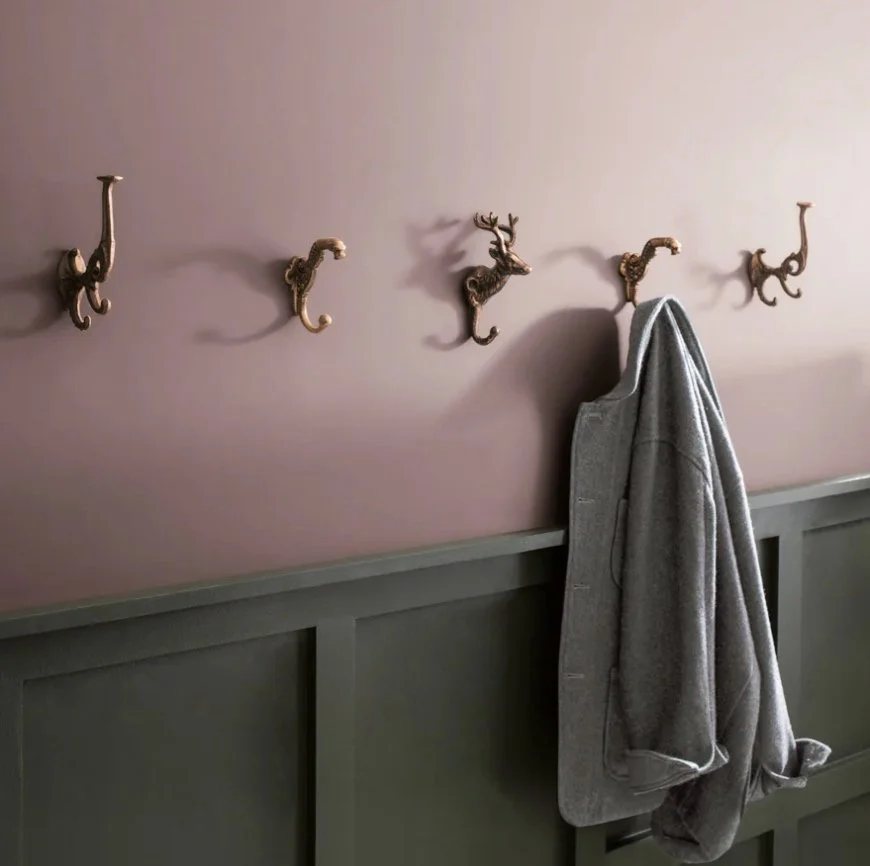
An accent wall painted in Cinnamon Slate adds depth to this modern entry interior space, framed by neutral-colored wainscotting that allows the hue to stand out.
3. How can I create a cohesive color scheme throughout my home?
Creating a cohesive color scheme is about balance and flow. Start by choosing a main color palette for your home, then use variations of these colors throughout different rooms. The 60-30-10 rule is a helpful guide: use 60% of a dominant color, 30% of a secondary color, and 10% of an accent color in each room.
Consider using a neutral color for connecting spaces like hallways to create a sense of continuity. You can also create unity by using the same trim color throughout your home. Remember, cohesion doesn't mean every room has to be the same color - it's about creating a harmonious flow from one space to another while allowing each room to have its own character.
This image presents the full Benjamin Moore ColorSpectrum prominently featuring Cinnamon Slate alongside other harmonious colors like Iced Mauve, Oyster, and Pampas Grass. Always consider creating a cohesive plan.
4. Why should I consider engaging in a paint color consultation?
Selecting the perfect paint color can significantly influence the overall ambiance and aesthetic appeal of a home or commercial space. A professional color consultation can provide valuable insights and expert advice tailored to the homeowner's personal style, lighting conditions, and existing finishes and furnishings.
While the effects of color are undoubtedly rooted in psychology, the way color interacts within a space is fundamentally based on scientific principles and must be approached with precision to effectively convey the desired overall feeling of that environment. It is essential for color to maintain a sense of harmony and livability, creating a balanced atmosphere that enriches the experience of those who inhabit the space.
With color being such a vital element in interior design, choosing the wrong shade in paint or furnishings can easily ruin an otherwise beautiful and harmonious design. Missteps in color selection can lead to an overwhelming sense of dissatisfaction, resulting in too much stress, wasted time, and unnecessary expenditure, often amounting to thousands of dollars that could have been better spent elsewhere. By collaborating with an experienced interior designer, homeowners can avoid common pitfalls, ensure a cohesive color scheme and look throughout their home, and ultimately create a more harmonious living environment that reflects their unique tastes and preferences. Be confident knowing you are protecting your investment in your home.
When Color Counts
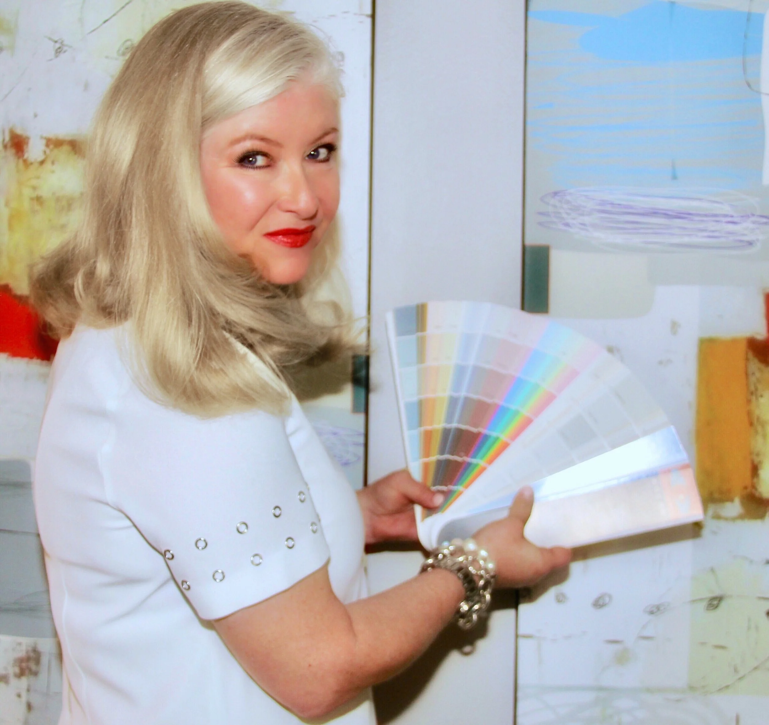
Our lead Interior Designer Denise Jadd is Benjamin Moore Color Certified and has been a devoted brand follower for decades.
Conclusion
Benjamin Moore's Cinnamon Slate (2113-40) is more than just a trending Color of the Year; it's a versatile tool for Florida homeowners and interior designers to create spaces that are both sophisticated and inviting. As we explored here, the allure of Cinnamon Slate lies in its depth, versatility and warmth. Whether used as an accent or the main color scheme, Cinnamon Slate has the potential to elevate any interior design project.
The deep violet hued Cinnamon Slate living room is styled with lush velvet upholstery in jewel tones that compliments shades from the Color Trends 2025 palette, a modern sensibility of foundational colors creating harmony throughout the space. The harmony comes from nature, just like violets grow with deep green leaves in rich earthy soil. This space exudes warmth, comfort and a sense of ease, of what we at Domaine Luxe refer to as an Unbuttoned Elegance.
As we look forward to 2025, this Color of the Year promises to bring warmth, depth, and style to homes across the Sunshine State. Its ability to adapt to various design aesthetics makes it an ideal choice for homeowners seeking a fresh yet timeless look.
Cinnamon Slate
Close-up of the paint swatch "Cinnamon Slate," illustrating its unique blend of heathered plum and velvety brown tones that evoke warmth and sophistication.
By seamlessly blending with both contemporary and traditional elements, Cinnamon Slate Color of the Year, 2025 invites creativity and personalization in every space. Ultimately, this rich hue not only enhances the beauty of interiors but also fosters a sense of comfort and well-being, making it a perfect addition to any home in Boca Raton, Delray Beach, Palm Beach, and the rest of Florida's vibrant design landscape.

